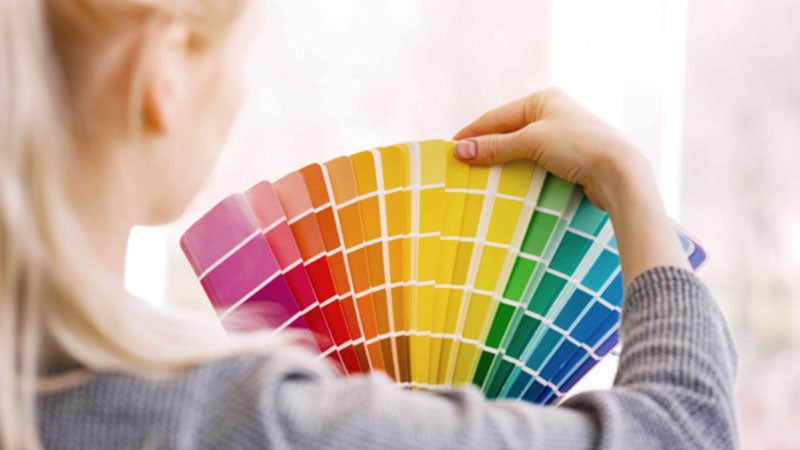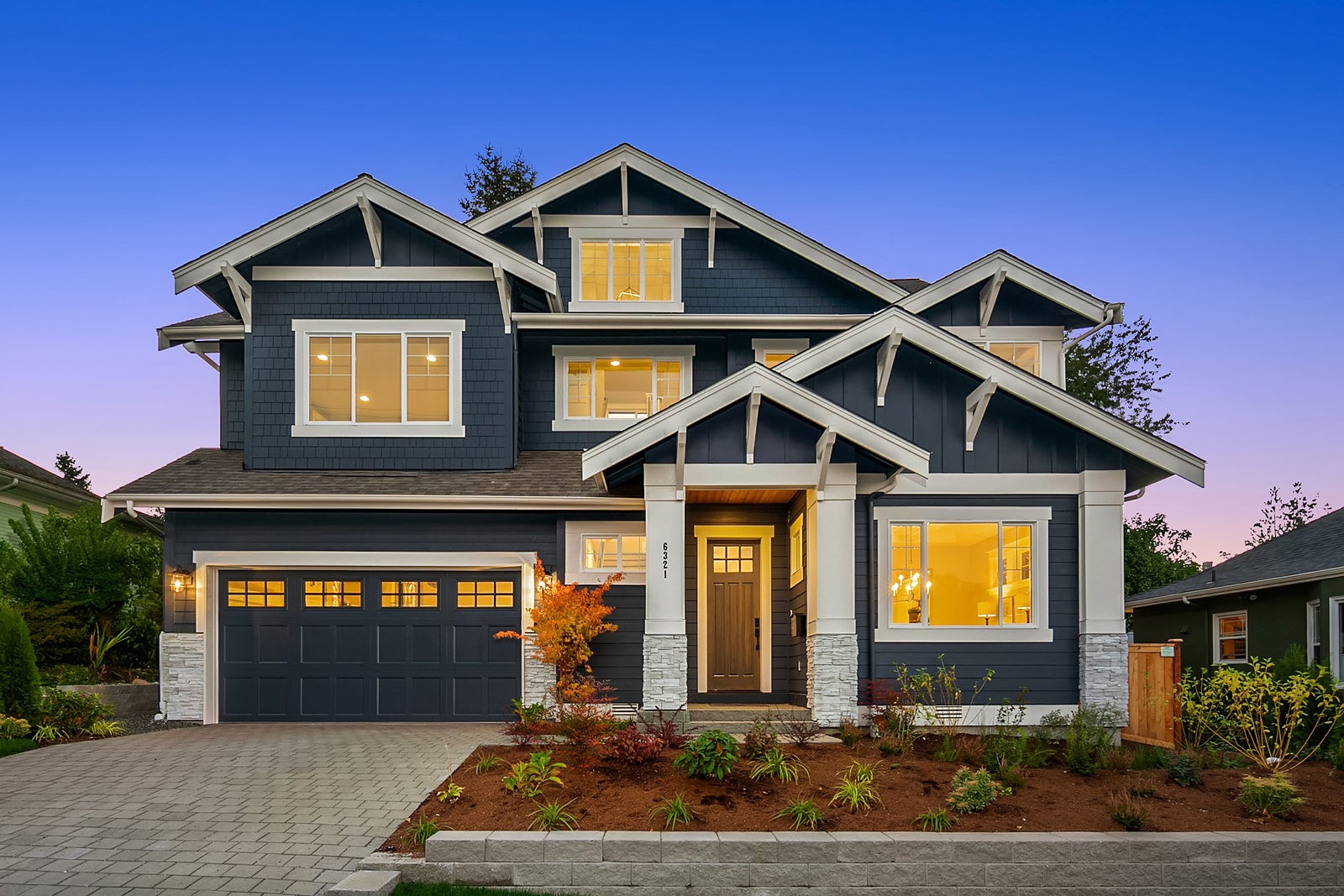
The new year is here, and it’s bringing a new look in home color trends. Look for colors that boost your spirit with palettes of vibrant color that might remind you of opening that box of 128 crayons.
In 2017, Pantone Color Institute declared “Greenery” as its Color of the Year. The invigorating color aligns with the desire to revitalize ourselves. This year, Pantone is focusing its attention on palettes of colors that reflect different types of energies. Many of these home color combinations feature vibrant shades, which is the direction that will be trending in 2018. “Playful”, for example, blends bright yellow and lime green. “Verdure” takes its cue from nature, with colors like Celery and berry-infused purples.
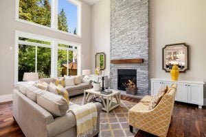
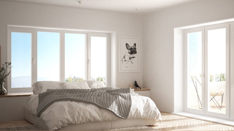
There’s still room for people who prefer their neutral colors for home décor. But you might find that neutrals are taking on a bit more commitment to color and metallic accents—currently being called “the new neutrals”.
Sherwin Williams has named “Oceanside”—a bold teal shade that the paint company describes as “deep and moody”. Oceanside blends well with the current “mermaids” obsession, but also presents a richness, particularly when paired with a bright white.
House Beautiful’s editor-in-chief Sophie Donelson describes this hue as “a cocoon color”.
“I love a color that’s also a state of mind — that’s what Oceanside feels like to me,” Donelson explains. “We often see similar hues chosen for libraries and studies, because its depth makes it comforting, but also bold and adventurous. It’s like watching a Nature channel deep-sea exploration from the comfort of your sofa!”
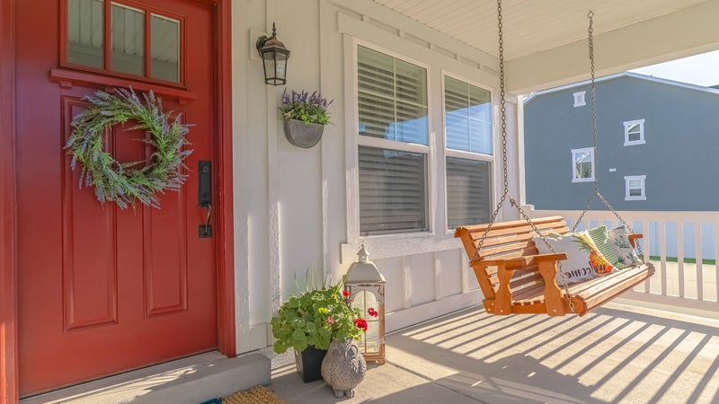
Benjamin Moore continues the shift toward bold color by announcing “Caliente” as its 2018 Color of the Year. The vibrant red reflects the royalty of a red-carpet event, “the assured backdrop for a book-lined library, a powerful first impression on a glossy front door The eye can’t help but follow its bold strokes. Harness the vitality,” says Ellen O’Neill of Benjamin Moore & Co.
Behr has jumped into home color trends and announced its first-ever color of the year. “In the Moment” is a soft shade of blue-green that the paint company describes as evoking “a sense of sanctuary and relaxation amid our always-on lives.”
Behr also presents 19 more color trends that range from the neutral “Wabi-Sabi” and “Soft Focus” to the bold “Spirit Warrior” and “Wide Sky” and the deep “Constellation Blue” and “Nocturne Shade”.
What will you do with your home décor in 2018? Do these trends in home colors inspire you?
